Showing posts with label Illustration. Show all posts

Monday, 15 May 2017

Our Yarden banner design

My good friend Amy Willet commissioned me recently to create a banner for her new blog called "our yarden" she wanted a collection of simply hand drawn/graphic plants and gardening equipment in a repeated pattern.
initial thumbnail sketch
limited colour guide

Final banner design 

in use on website, instagram and Facebook

Sunday, 10 May 2015

New Prints

After looking for ages for prints for my new office and my mums kitchen, I decided to create my own vintage inspired object prints, as nothing I found online was quite right. 

It was also a great opportunity to try my hand at Illustrator, which I love. However I did revert back to photoshop for the texturing/gradients and scaling for print 

Office:


Kitchen:


Sunday, 18 January 2015

Skwigly Advent Creation


This was my contribution to Skwigly's Advent Calendar this year I took inspiration form cartoon modern design and the good old 'lets all go to the lobby' cartoon. Gif's are quite fun aren't they? created in Photoshop designed and animated.

Heres the link to the article : http://www.skwigly.co.uk/advent-calendar/day-3-laurabeth-cowley/

Wednesday, 9 July 2014

Skwigly Banner July 2014

I did a new banner for Skwigly this month. Look it moves. Oooooo!


Inspired by my home town (were I'm currently residing before my next job starts in sept). Every local artist has drawn the lighthouse at Portland Bill, this is the closest I'm getting! 

Wednesday, 15 January 2014

Un-Advent calendar banner!

 photo lordsaleapin_zpsc91edc84.gif

I was asked by the nice guys at Skwigly Magazine to create a banner for the Un-Advent Calendar, so i came up with this little homarge to Aadman co-founder Peter Lord, anitmed by my good friend Ben Mitchell . I also received some rather nice comments form some rather big names, which was great! 


Thursday, 28 February 2013

Another entry for the JS competition


Another Lino cut, with a favourite quote of mine. 

John Smith Bookshop


Here are a few designs i've been working on, i thought i'd enter them for John Smith bookshop stationery competition. I really like bugs and print so I did some Lino prints and digitally edited and cleaned them. There just a bit of fun really away from all the animation. 


Tuesday, 31 July 2012

Revisiting...you little beauties

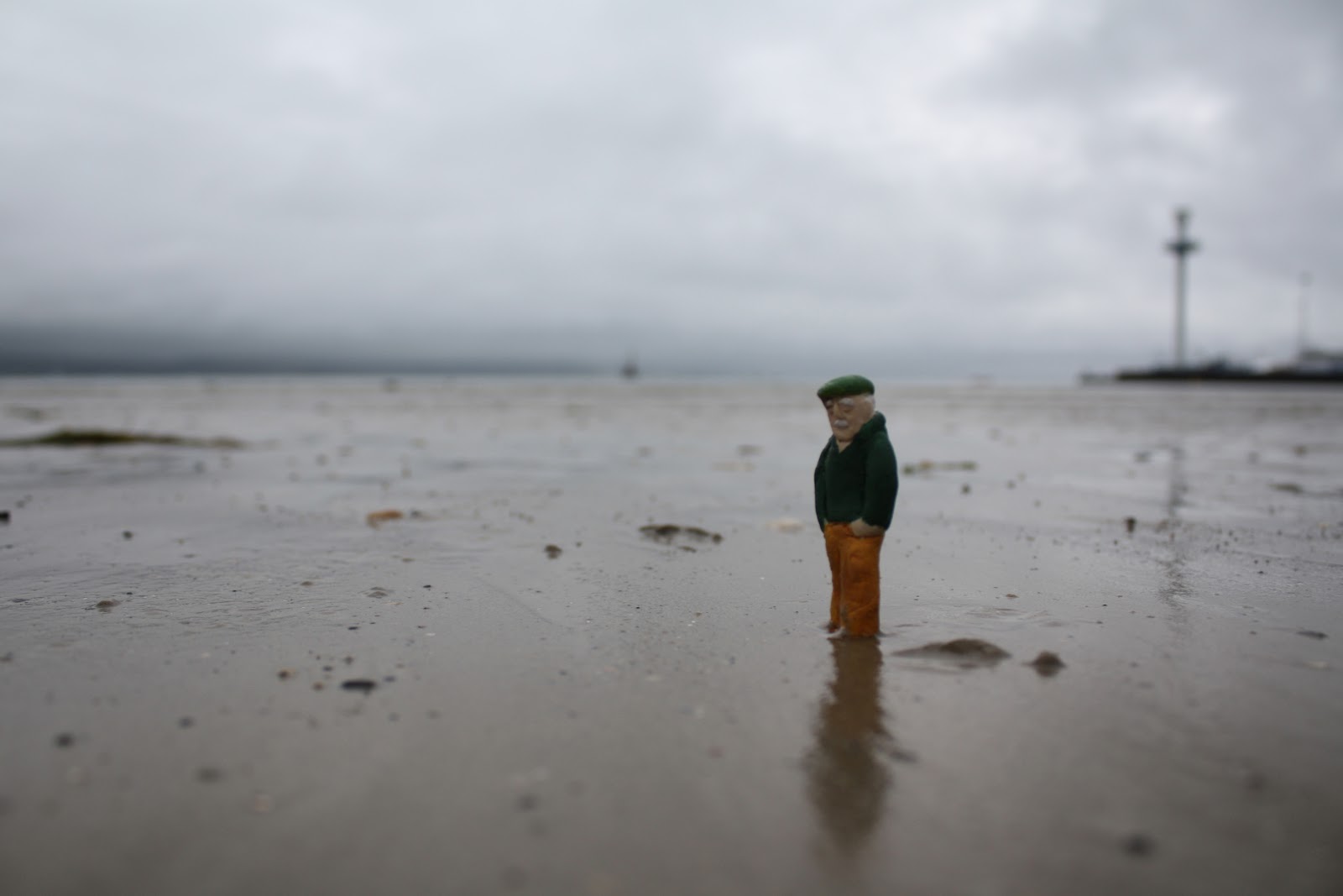
Last year I created miniature models for my final project...based around the english sea side, I wanted to revisit it over the summer but I was too....busy (yea lets go with that). Any who I've been contacting local independent shops in my home town about the possibility of selling them as postcards, but I wanted to revisit  them and produce new imagery with them in my home town...more appealing to the 'grockles', you know! (and if understand that word your probably from around here).

So I began today, or re-began...not sure.


The Hippy Hippy Shaker


still attempting something new

trying something new...


Playing around with bold and graphic look. Not sure how keen I am on it. I feel they may look better if they were in some sort of print Process, perhaps screen?

either way not sure if I like them...feed back please?


Saturday, 12 May 2012

Narrative Print

Hand in for this year is official over which mean my second year at CSA is over. What a great year it has been to.

following on form the last piece i posted which was the written module i took this year I also took a modular in print. Print is a method of working i became quite familiar with in earlier education, and if I were to take a more illustrative root i'd of done a lot more of it. Anywho...

CSA has a great print studio and amazing letterpress studio...are first brief was to visualise a  poem by Philip Larkin called Take One Home For the Kiddies these are my final outcomes.


detail

Second part of the module was to create a series of prints depict a classic tale. A chose to create a suit for Chaucers Canterbury tale: the Nuns Priest Tale: Chanticleer. created using Lino.


Tuesday, 7 February 2012

Marty

Character design created for the Don't Panic: Ray Harryhausen competition.

Feel free to vote for my entry, would be greatly appreciated:

http://www.dontpaniconline.com/designbrief/ray-harryhausen-animation-competition/entry/2562


Friday, 3 February 2012

ITD:Last Brief:Editorial

For the final brief we had to chose an editorial and produce a piece to fill the allocated space.

I chose one around the argument of orchid and dandelion children, the idea being that some children are predisposed to being one way or another, if an 'orchid child' is in a loving/nurturing environment it will bloom and do very well in life, if its brought up in less than ideal way it will wither, whilst dandelion children have the ability to survive no matter what. I think i'm probably an orchid.....


So here are some ideas I had


Add caption


I made interchangeable faces so that all the characters could be changed to meet the brief. 


Sunday, 29 January 2012

ITD:character- combine and animal and a mode of transport?

Bit of an on odd brief this week, we have to combine a mode of transport and an animal, I did some brainstorming but one of my earlyest ideas remained my favourite the Segway Bear, I thought this would be a great opportunity to revisit my circus Brief from first year, which I was disappointed with. So here is the one...the only...BANJO....

Emotion Board of Banjo


We were required to show them in four states of emotion, as fallows...

Lonely

Destructive

Depressed
Anxious
I also made a stand up puppet, he's animated too.
A very fun brief all in all. 

Friday, 27 January 2012

ITD: stamps

New Brief to create a series of four stamps based on a State.
This was a bit of a doozie, two week brief, I wanted to use cut out something about the format of a stamp really appealed to my cut out frame of mind....which made me thing states of mind, staes of emotion.

the concept behind these stamps is that the sender would by this stamps as pre-cursa to the contannt of the letter inside i.e. if you were sending a birthday card or informing someone of a wedding you would use a euphoric stamp.


Furious: "I'm angry!" possibly a over due bill
Melancholy:"Bad news" your ill.
Affection:"I <3 you" for a love letter x
Euphoric:"SO VERY HAPPY!" for good news.


All in all pretty pleased with these. They went down well.
There testament to a simple idea and clear design winning out on the day!

Maybe I should try that out more.